Auslan Tutor App Redesign
Learn Auslan in your pocket
Context:
A personal project to redesign a helpful app (Auslan Tutor) I discovered whilst learning Auslan (Australian sign Language).
Year: 2020
Why did I choose to Re-design this App?
I am not new to learning languages, particularly using technology such as mobile apps. So naturally I looked for apps to supplement my learning when I signed up to a beginner's sign language class. Whilst there are a plethora of apps for language learning, there were few for Sign Language and most were for ASL (American sign language), rather than Auslan. I wanted a dictionary style app like the many spoken language dictionary apps out there. Only a handful of Auslan dictionary apps existed in the app store.
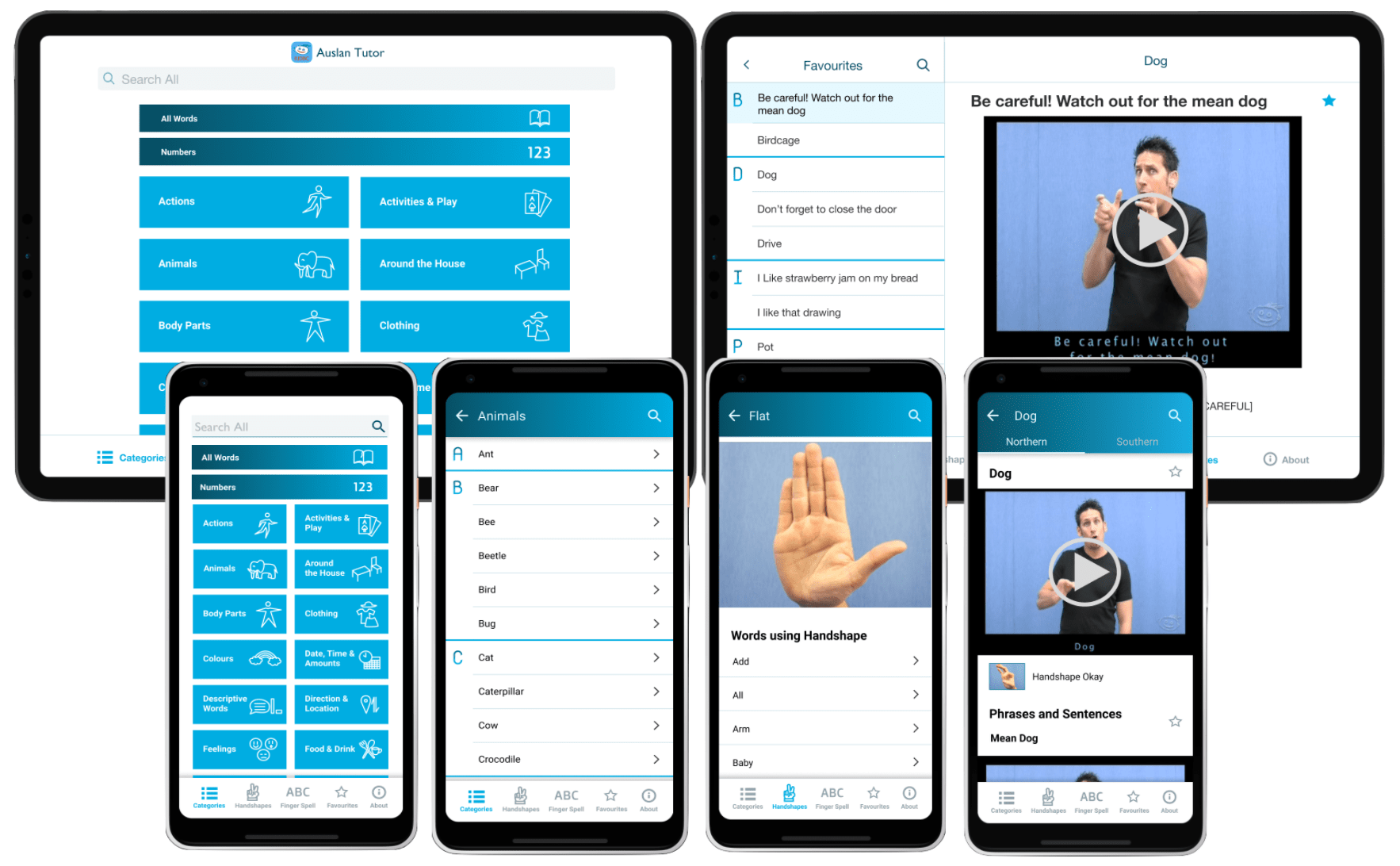
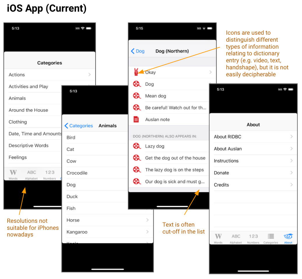
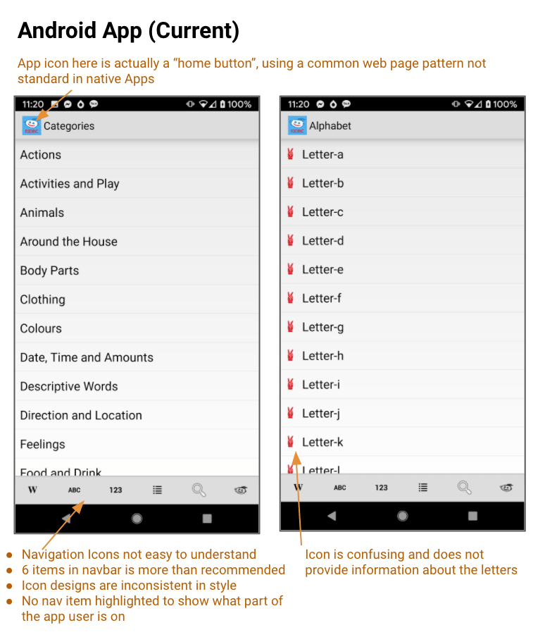
The Auslan Tutor app was one I discovered where I found its contents and features to be very useful. Not only showing words, but it showed the words signed within a sentence as well as other features. However despite the usefulness of the content, I found the navigation to be difficult and the design has clearly not been updated since it was created 10 years ago. The iPhone app did not even fit to the screen resolution of most iPhones in use nowadays. Looking at the app store reviews people had similar comments, where parts of the app couldn't fit on the screen and being unable to find certain features.
I really wished for a more modern experience to help encourage people to learn Sign language and understand the rich culture of the deaf community. This wish motivated me to do a redesign of the app to convey that learning sign language is just as cool and trendy as learning Japanese or German.
Auslan is the main sign language of the Australian Deaf community, derived from the term "Australian Sign Language". It is related to BSL (British Sign language) and NZSL (New Zealand sign language) and is very different from ASL (American Sign language). Auslan has two main dialects: Southern dialect (used in Vic, SA, WA) and northern dialect (used in NSW and QLD).
Sign languages are a way for people who are deaf or hard of hearing to communicate with others. It uses signs and gestures to convey a meaning without sound. Sign languages uses a variety of ways to convey meaning including: handshapes, orientation, location, movement, expressions and finger spelling.
There is no universal sign languages, but rather many different sign languages in the world like spoken languages. Just like spoken languages, sign language has also evolved over time and new vocabulary is added over time.
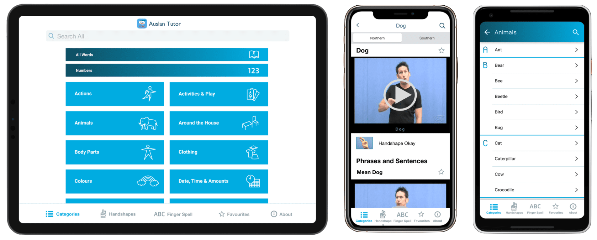
Auslan Tutor is a video-based Australian Sign language (Auslan) learning App from RIDBC - Royal Institute for Deaf and Blind Children. It has been designed to assist families of young deaf children learn Auslan and contains more than 500 Auslan signs.
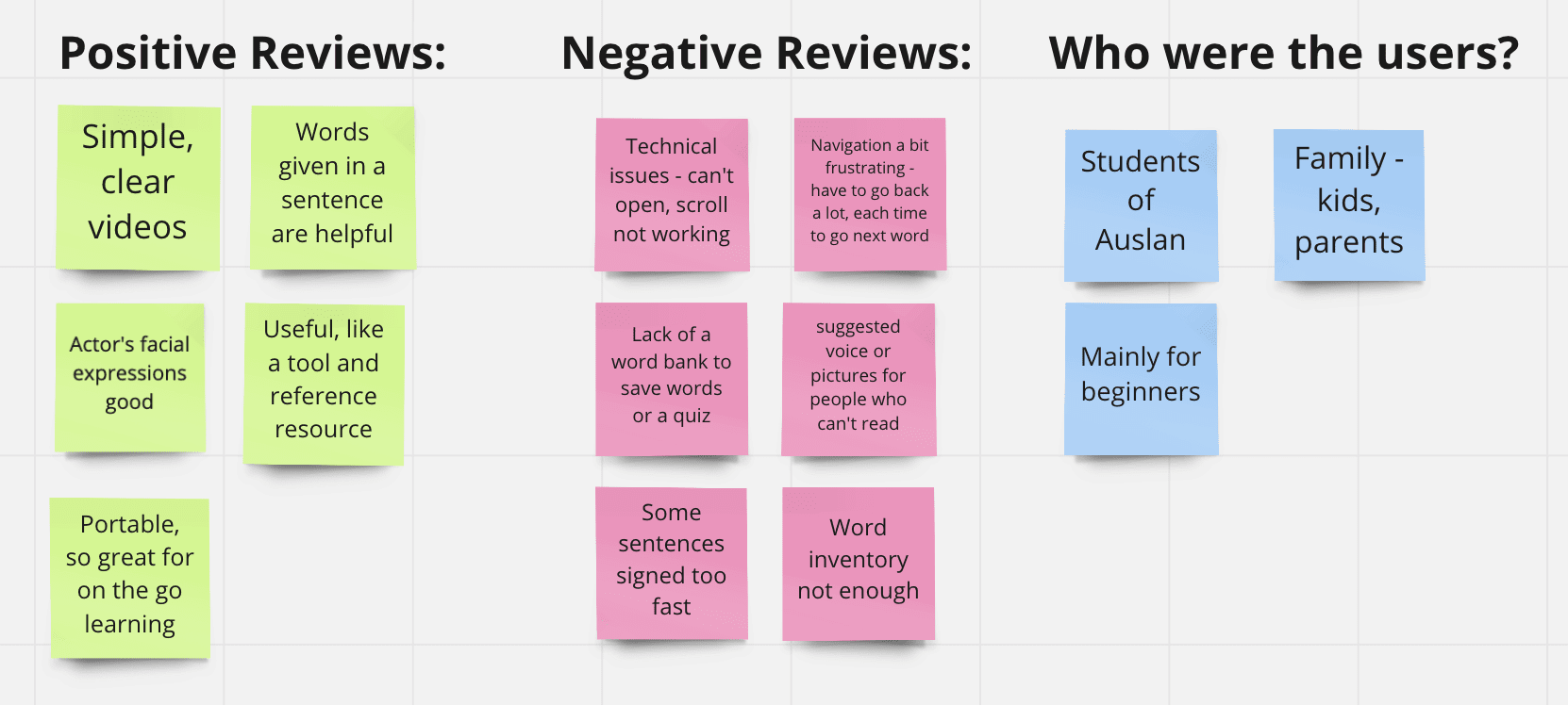
First I read through all the app reviews for the existing app. Both had high ratings (4.4 in Google play store, 4.0 in Apple store). Only Apple store had reviews for the app. Below is a summary of the main points gathered from the reviews on the apple store.
I downloaded the app on Android (phone) and Ios (iPad) to conduct a review of the existing design in order to identify specific design problems and opportunities in the app for improvement.
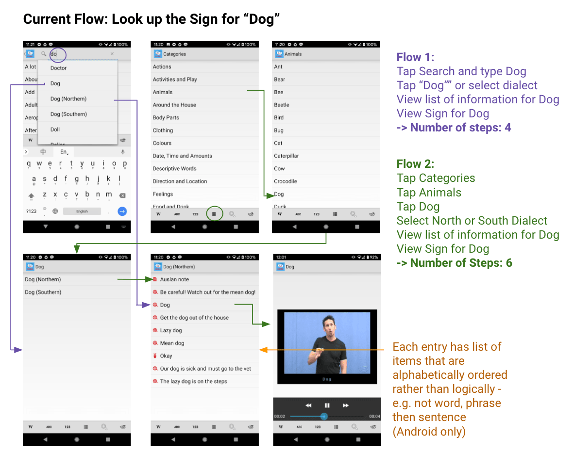
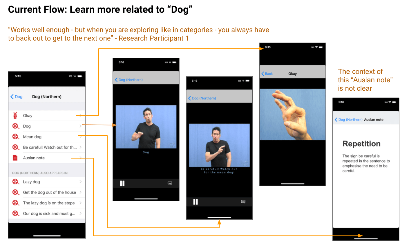
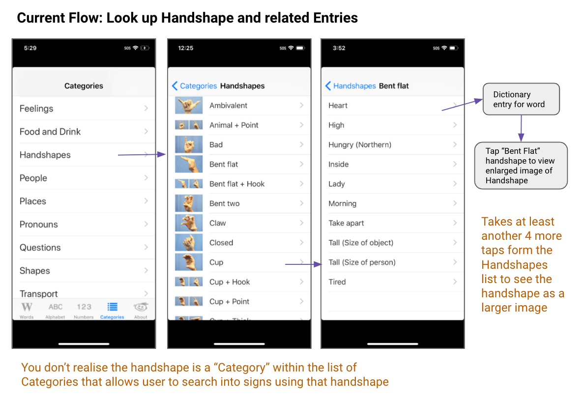
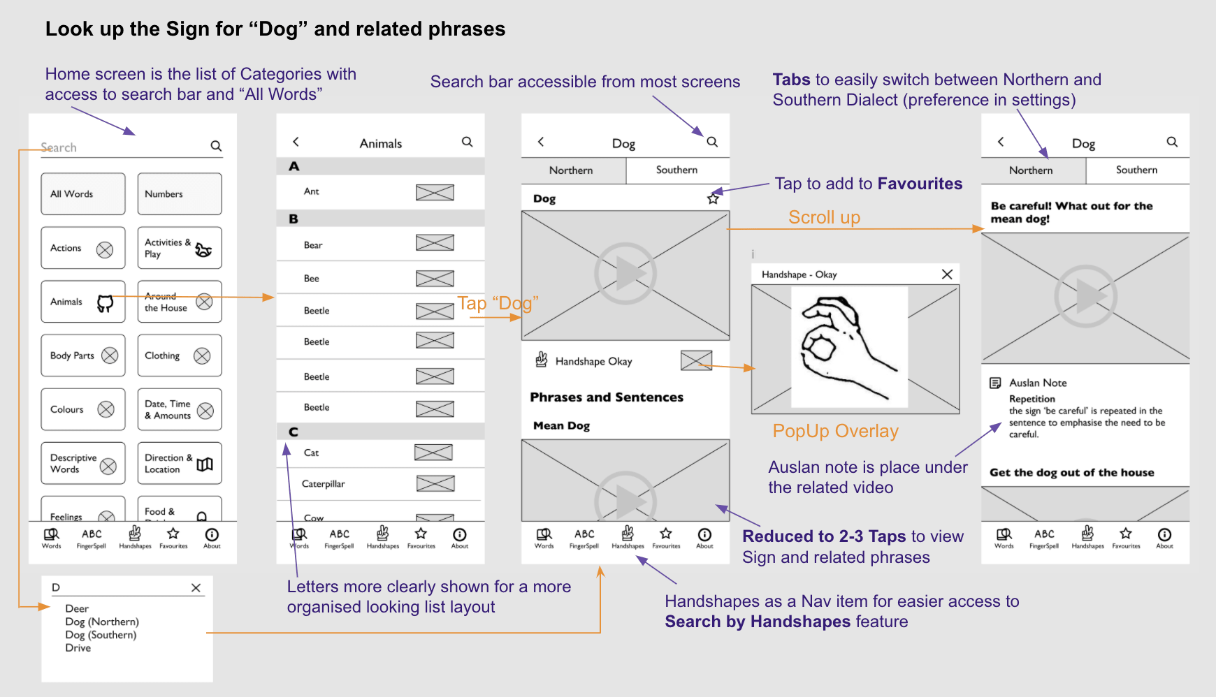
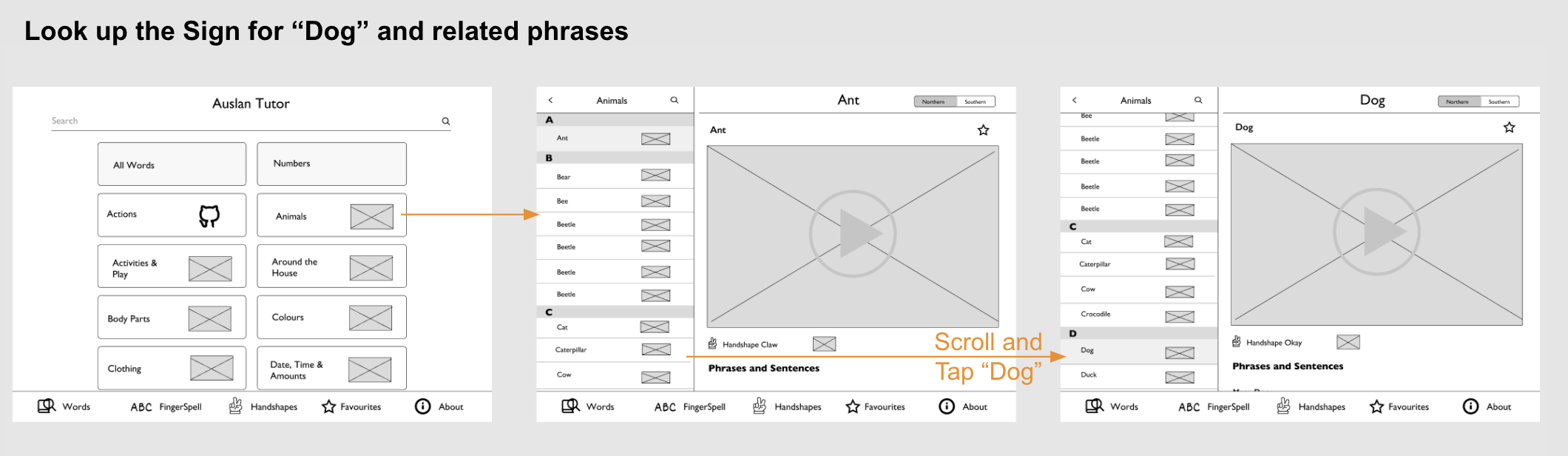
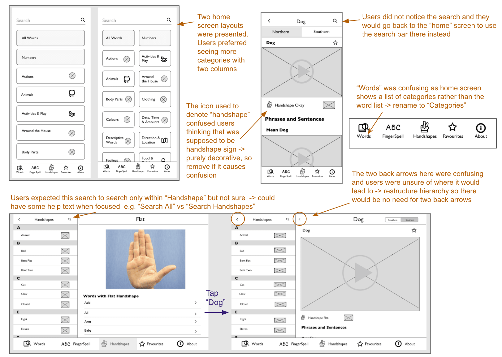
The overall flow requires 4-6 steps to get to a sign - a lot of back button usage is required for the user to see each piece of information for an entry. E.g in order for user to view the Auslan sign and hand shape for dog, they would have to view the dog sign video then tap back and choose the handshape to see handshape.
"Works well enough...but when you are exploring...you always have to back out to get to the next one...its quite deep into that tree structure so you do a lot of tapping to get in and out of the hierarchy"
~ Research participant 1
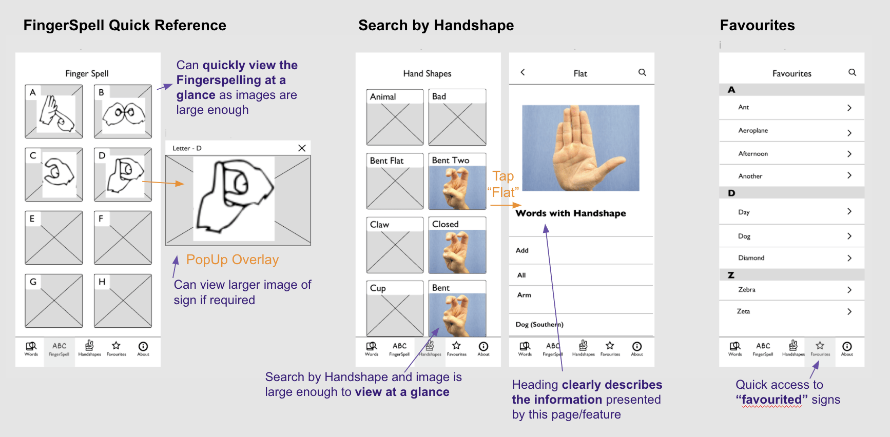
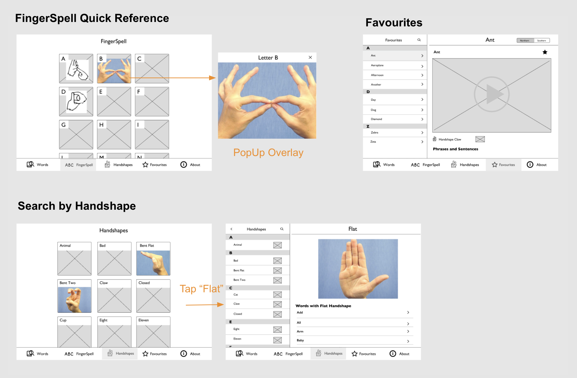
Some features are hidden deep within the hierarchy of the app - e.g. "Finger Spelling" and "Search by handshape" making the features hard to access or be known to the user
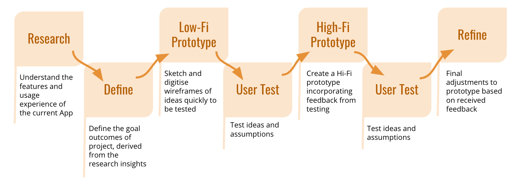
The findings from the App store reviews and ux/ui review were then synthesised to find common themes, leading to the following goals and target users for the project.
Primary user scenarios:
Derived from the App store reviews and App Analysis
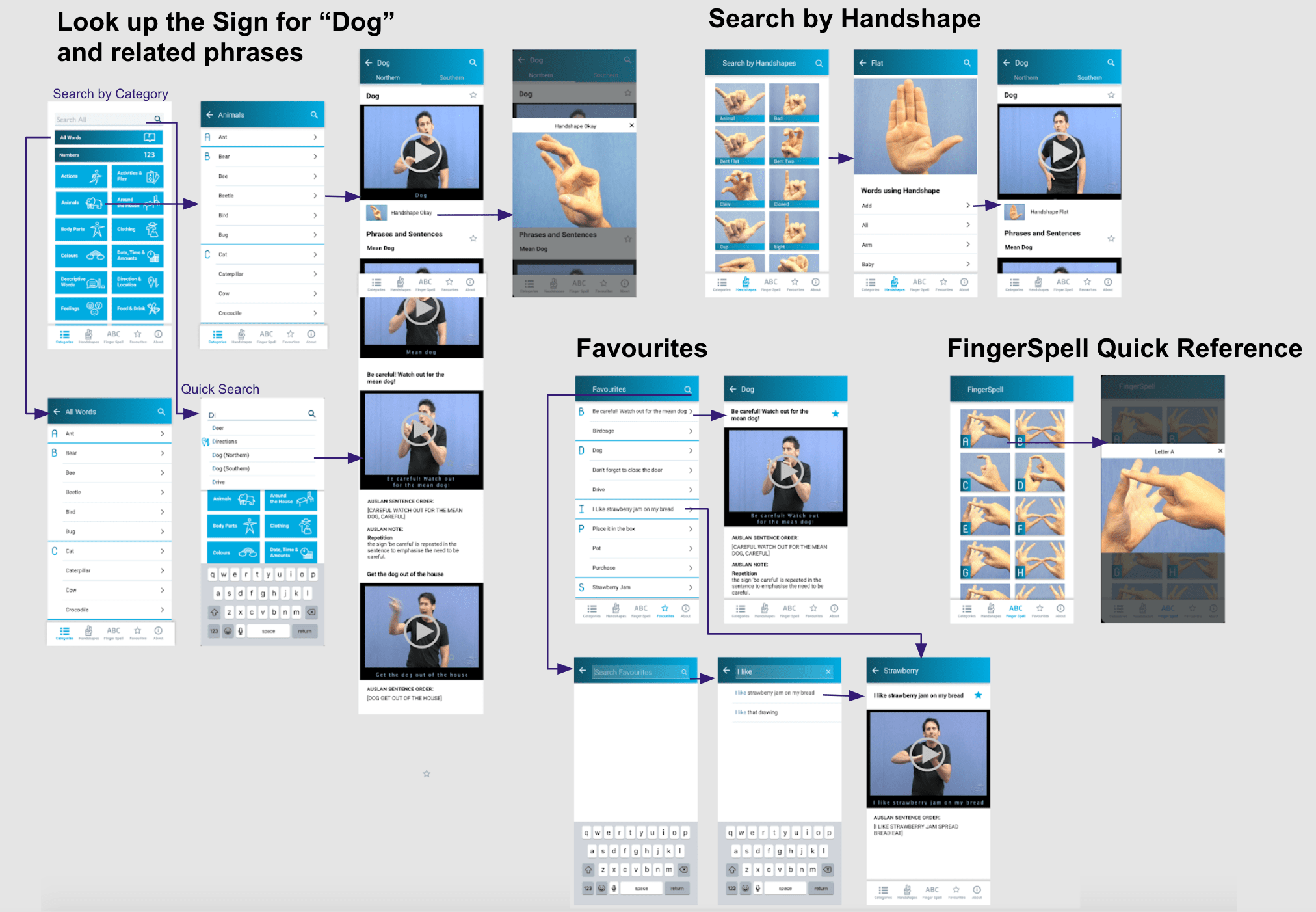
With the research findings and problem definitions in mind, I first hand sketched initial ideas of the new flow and layout. This was a quick way to brainstorm concepts, ideas and note assumptions to be tested.
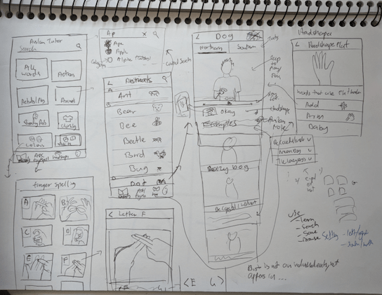
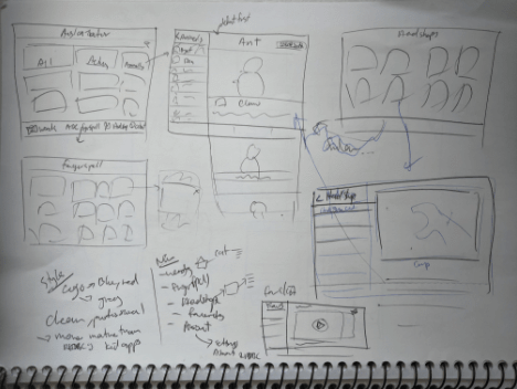
Then the sketches were translated into digital wireframes and then into a low-fi prototype for the first round of user testing. The new layout and flow was based on the redesign goals defined and improvements on the problems found in the current app analysis.
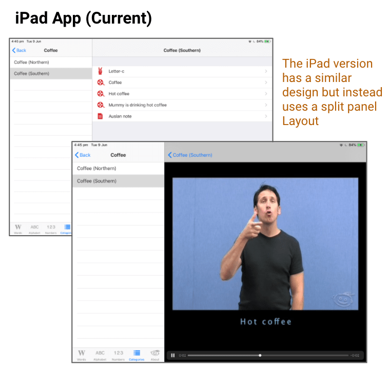
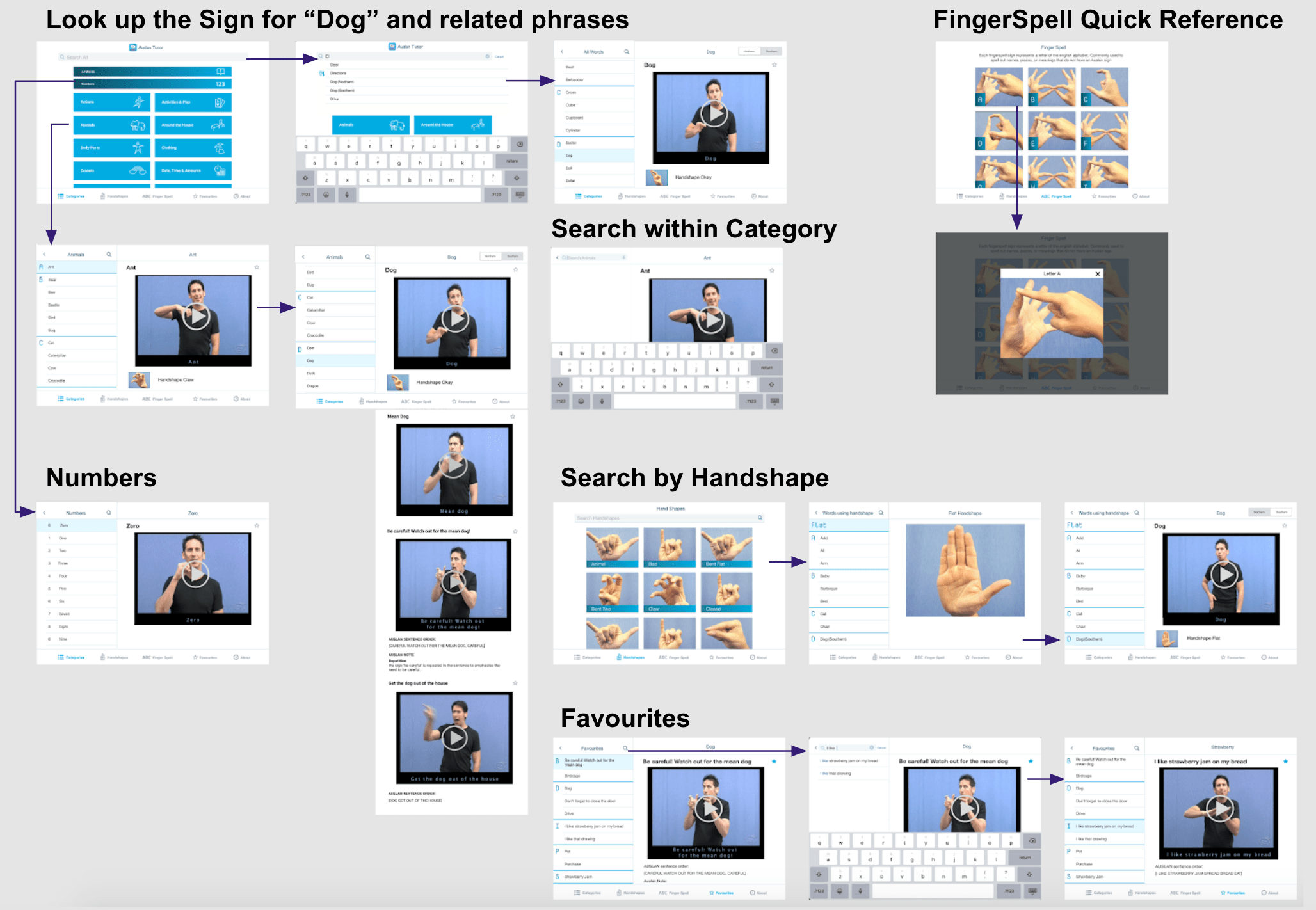
Similar flow and layout improvements were made for the tablet app redesign.
In light of the COVID-19 pandemic, the testing was done online. I set up zoom for video, shared an Interactive Figma prototype link and asked the user to screen share.
It was a semi-structured user testing session:
There were 2 participants. Both were students with around 2 years experience learning Auslan.
A Hi-Fidelity prototype was then made incorporating the feedback gained form the initial user testing session with the wireframes. This included adding styling the look and feel of the app with colours, typography, icons, images and prototyping finer interactions.
The colours of the app were a shade of blue, green and grey derived from the current apps' logo which is also the logo of the organisation. Compared to the other apps created by the organisation, this app was aimed more towards a slightly more mature audience rather than children. Hence instead of the more child like colourful, cartoony, fun feel of their other apps, I opted for a more calm, useful tool type feel focusing more on providing information clearly. The standard fonts, minimal font sizes and tapping targets were also considered for each platform.
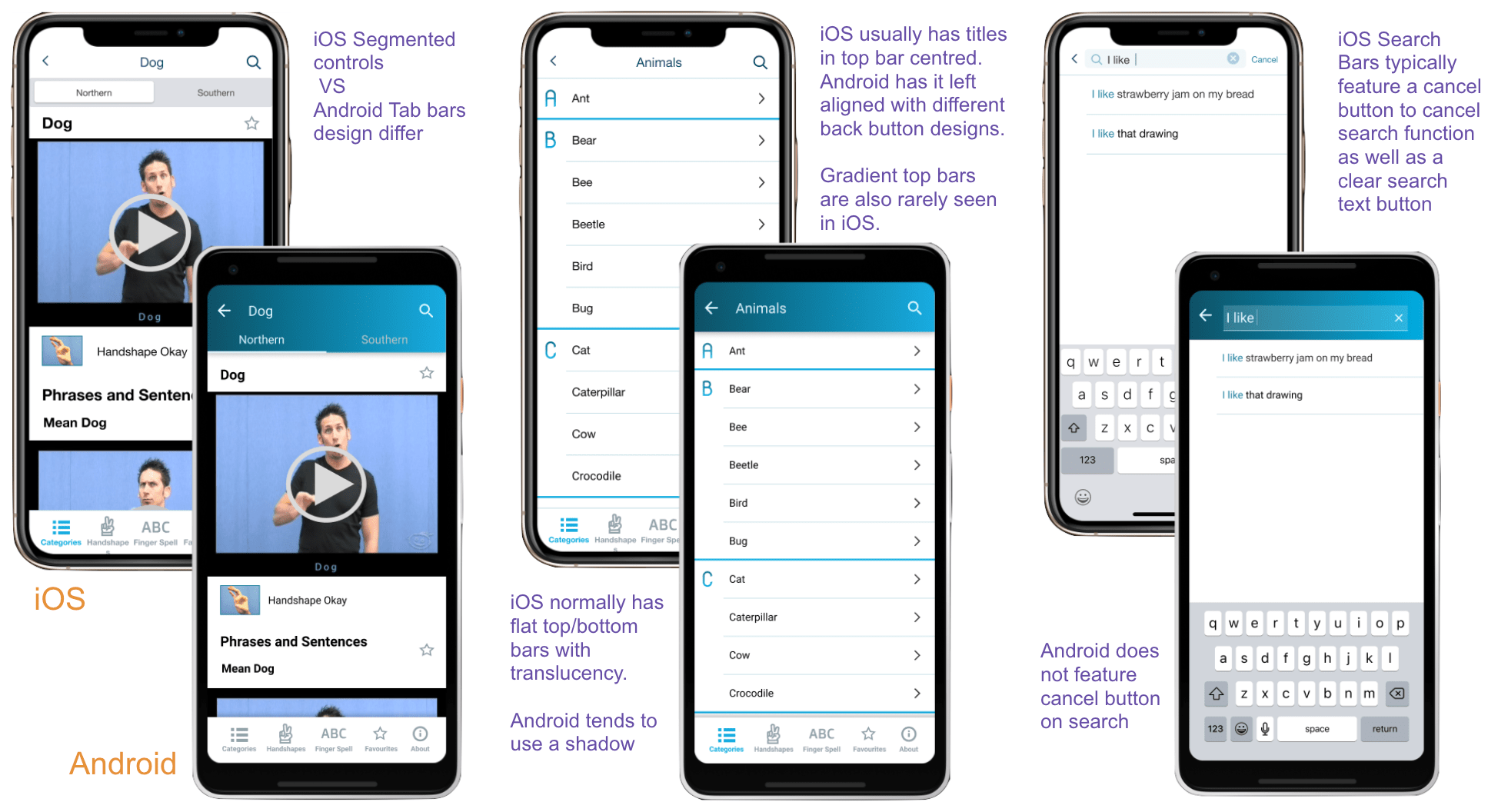
Several design decision were made for each platform to make the experience feel more natural to the user by conforming to respective native platform design patterns. Below is a summary with the phone design where in iOS it is has been applied to the iPad design.
A similar method was adopted for another round of testing, this time with the Hi-fi Prototype that incorporated the feedback from previous user testing.
2 participants - one is a student of Auslan, one is not.
Participants expressed that they found the app to be quite intuitive to use. They were easily able to complete the task asked of them such as look for a particular sign, understand sentence feature and save to favourites.
"The navigation seems more intuitive now - taking me back to the window i expect it to" - Participant 1
"Pretty neat to be able to search by handshapes... and learning things by category is useful to" - Participant 1
"yea I guess if i was learning Auslan this would be handy...easy to use" - Participant 2
The non-Auslan learner had some difficulties understanding some of the auslan characteristics such as what handshapes were and what is north and south as they did not know about the different dialects. When asked, they correctly guessed that it was some sort of variant of the sign.
Learning new tools
Online user testing
Design system